Building the app
Ideation
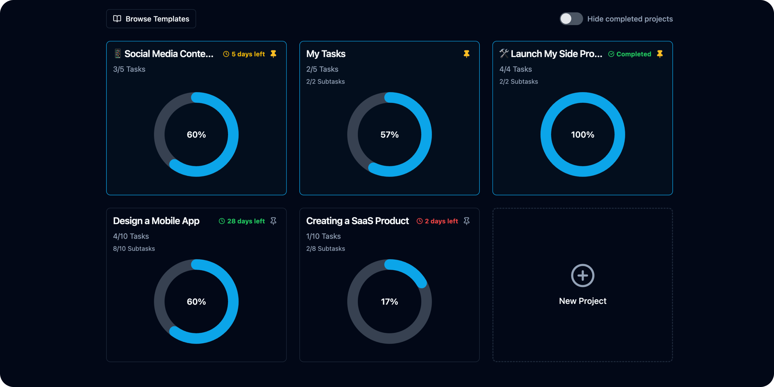
CheckLoad started as a solution to a personal frustration with existing productivity apps: progress bars—if they even existed—were hidden, overly complicated, or buried in documentation. I wanted an app where the progress bar was the centerpiece, not an afterthought. To validate the idea, I explored conversations on Reddit, Quora, and Facebook groups, where users echoed the same pain point: “I just want a simple way to see my progress without extra clicks.” This reinforced that the problem wasn’t just mine—it was widespread.
Core Functionalities
I began by writing out the essential features that would make CheckLoad stand apart:
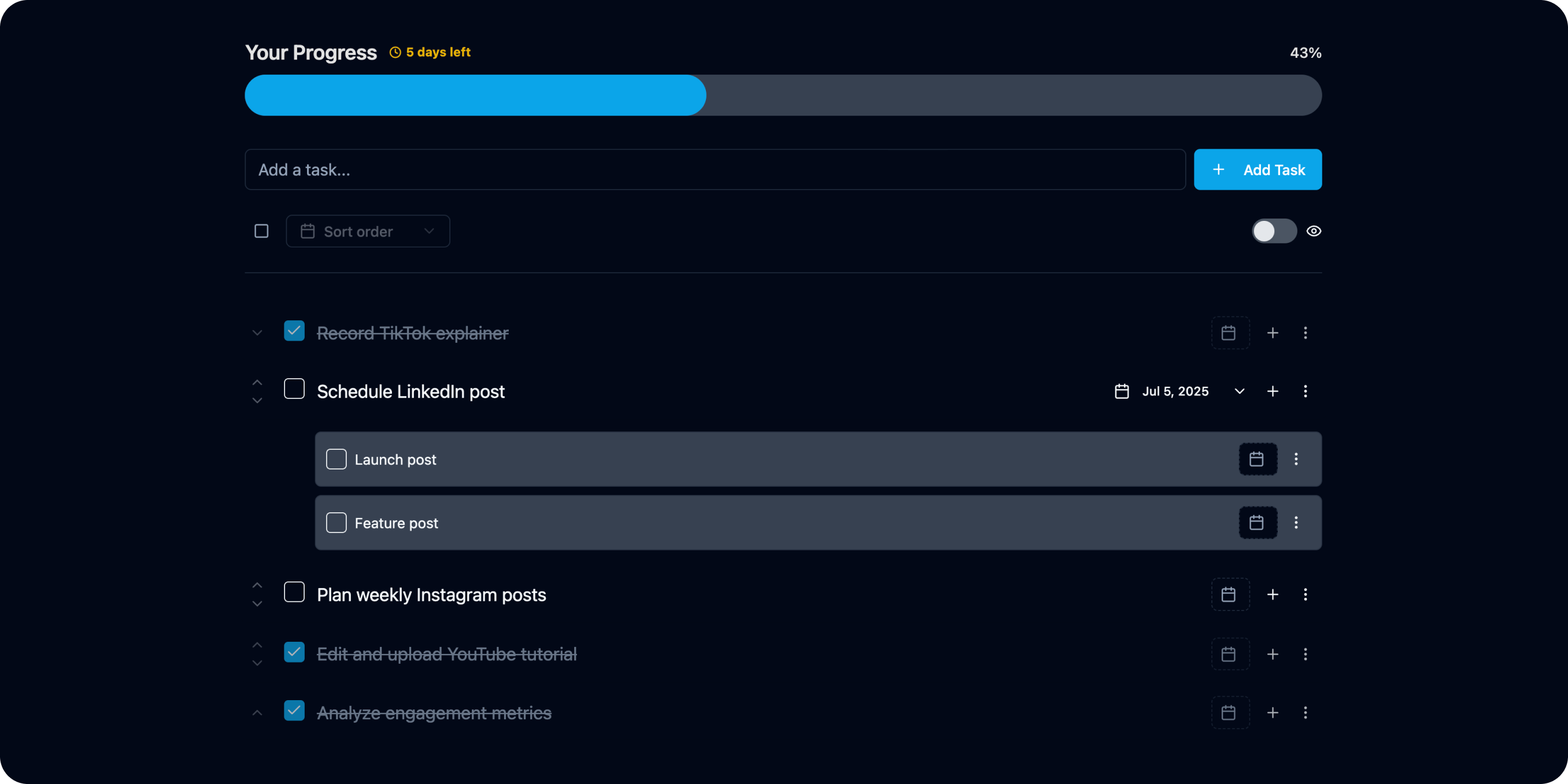
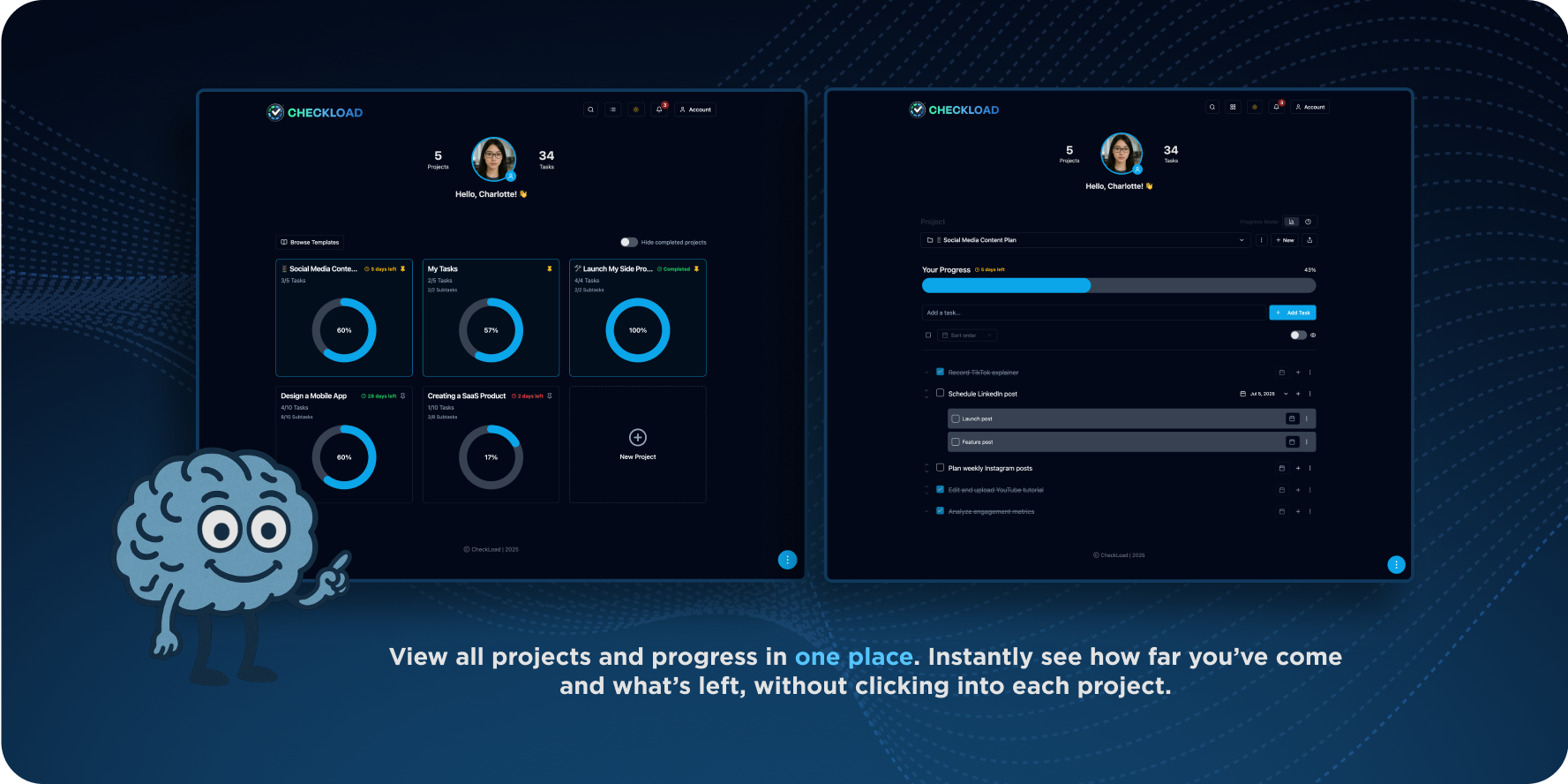
• Progress Bar Front and Center: No extra steps; visual progress is the first thing you see.
• Linear & Weighted Modes: Choose between equal-weight progress or weighted tracking for more complex projects.
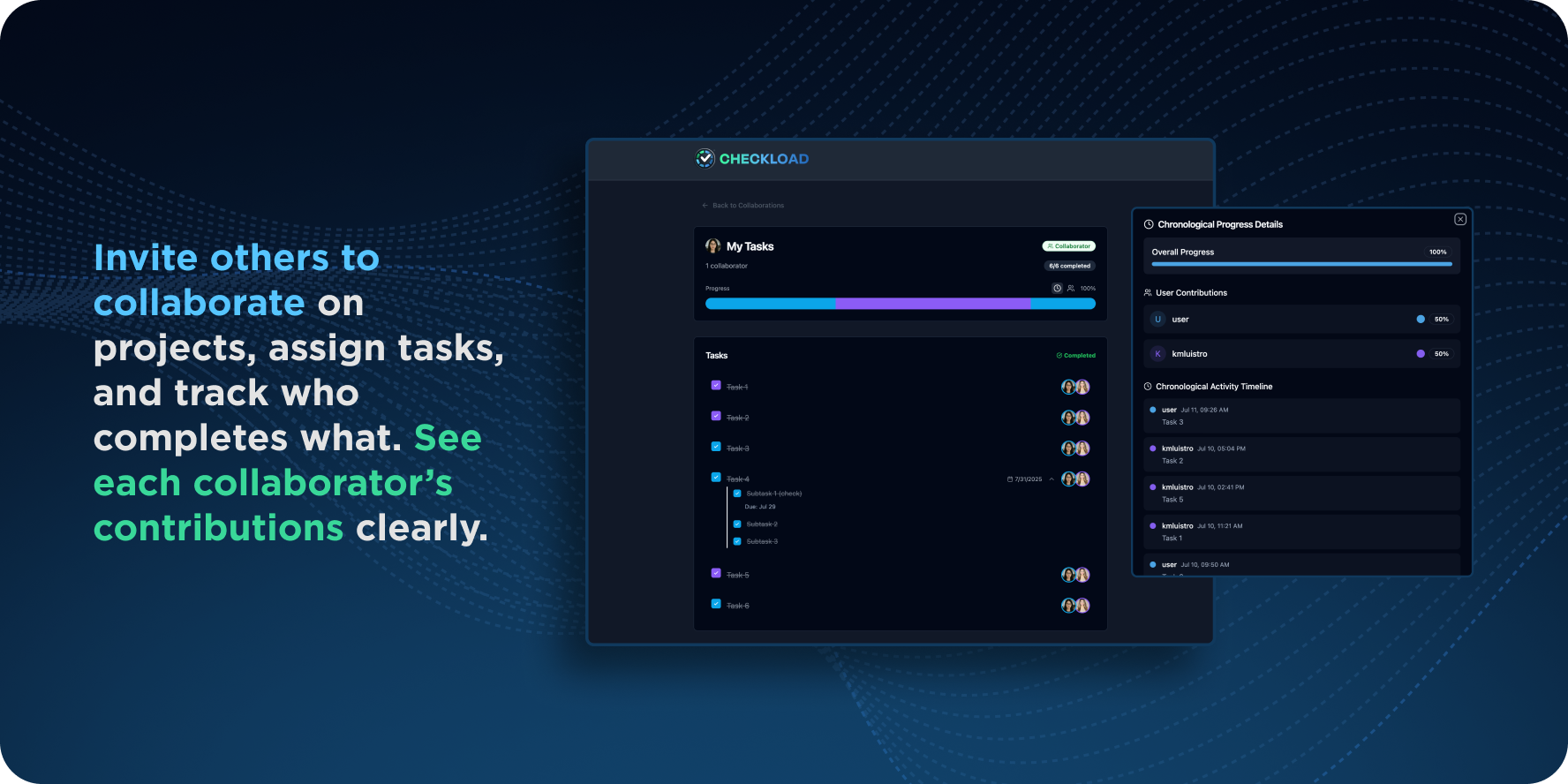
• Analytics Dashboard: Track productivity trends to help users improve over time.
• Collaboration Features: Invite collaborators with controlled permissions—they can check off only tasks assigned to them, or more if granted, while still seeing their contribution to the overall project.
Built-In Motivation
Beyond usability, I designed CheckLoad to be a motivator. Research in behavioral psychology shows that visual progress tracking increases motivation by making achievements tangible. According to the Goal Gradient Hypothesis, people work harder as they perceive themselves closer to completing a goal. Similarly, studies in productivity science confirm that seeing a progress bar “move the needle” provides a dopamine-driven sense of reward, which boosts consistency and follow-through. By placing the progress bar front-and-center, CheckLoad taps directly into this motivational loop, making productivity not just efficient—but satisfying.
AI-Assisted Development
To accelerate development, I leveraged ChatGPT and Claude to refine prompts, brainstorm UX flows, and generate starter code. This cut down experimentation time and helped me ship a functional MVP much faster.
Launch & Platform
I deployed the MVP using Lovable, which allowed for rapid iteration and a smooth hosting pipeline. Combined with Supabase on the backend and Cloudflare CDN optimizations, the app was stable and scalable from the start.
Integrations
To make CheckLoad more powerful and production-ready, I integrated:
• PostHog for product analytics—tracking feature usage and user behavior to guide improvements.
• Resend for reliable, modern email delivery—covering onboarding, notifications, and project updates.
• Stripe for secure subscription management and payments, giving users a seamless upgrade path.

UI/UX Enhancements for Efficiency
I implemented quality-of-life features that make CheckLoad faster and easier to use:
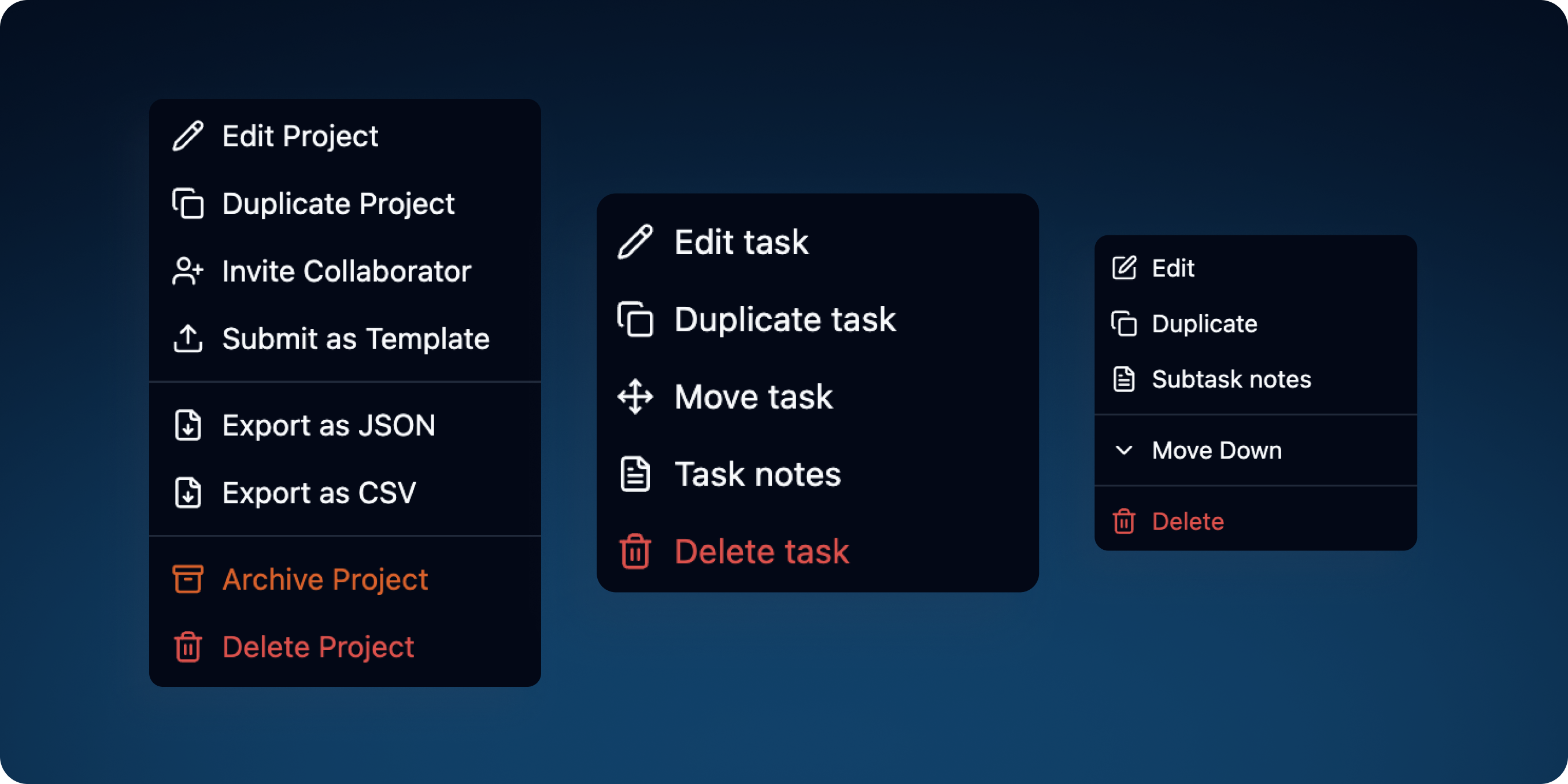
• Easy Duplication: Projects, tasks, and subtasks can be cloned instantly to save setup time.
• Smart Notes → Tasks: Bulleted notes can be converted directly into actionable tasks.
• Cross-Project Task Movement: Easily move tasks between projects as priorities shift.
• One-Click Check/Uncheck All: Toggle completion across a project or subtask group with a single click.
• Reusable Project Checklists: Projects can be reset and reused for recurring workflows or repeatable checklists.
Accountability & Engagement Tools
To make CheckLoad not just a tracker, but a community-driven accountability tool, I added features that encourage engagement and follow-through:
• Follow Projects: Users can follow projects to stay updated on progress.
• Like & Comment: Projects can be liked or commented on, fostering collaboration and encouragement.
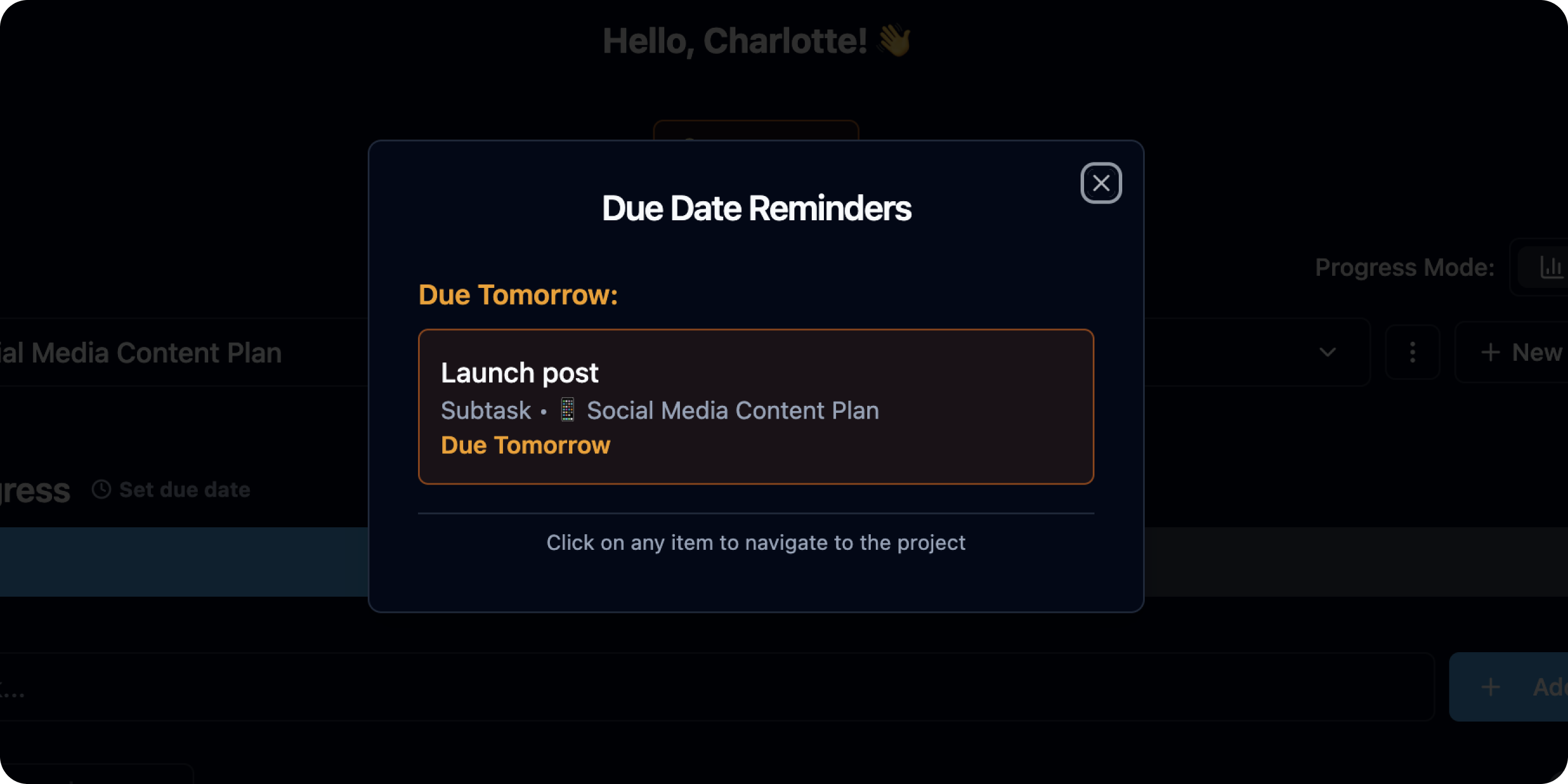
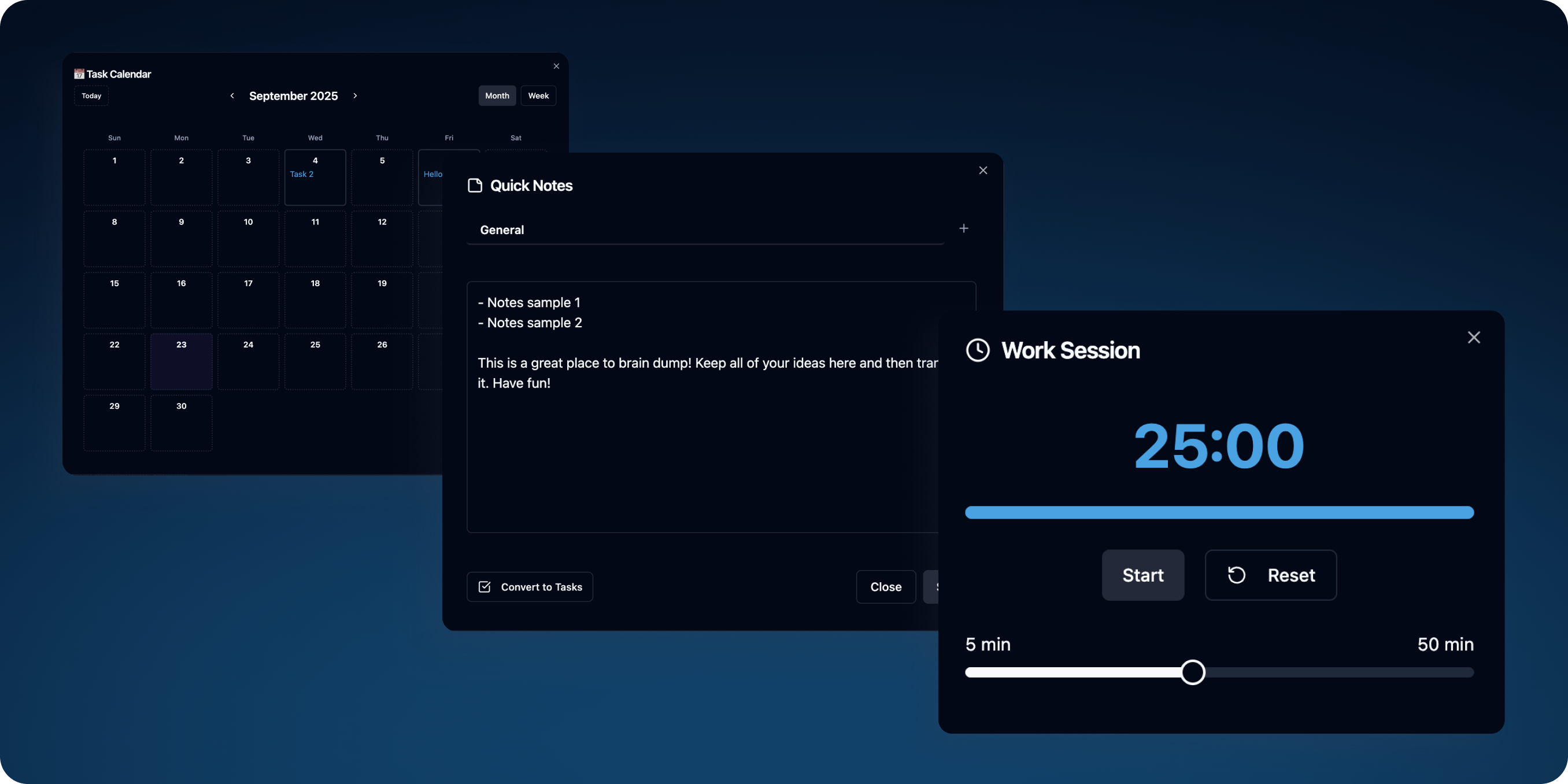
• Reminders & Deadlines: Deadlines can be set at project, task, and subtask levels, with reminders to keep users on track.
• Calendar View: All deadlines are visualized in a calendar view, helping users see the bigger picture.
• Pomodoro Timer: A built-in timer helps users break projects into focus sprints, balancing productivity and rest.
Design Approach
The design philosophy centered around being simple, personal, and intuitive. Unlike traditional SaaS dashboards that can feel cold or corporate, CheckLoad was designed to feel closer to jotting ideas down on paper—clean layouts, soft spacing, and a personal touch. The interface was made to be both desktop- and mobile-friendly, ensuring usability for different user types.
User Testing & Iteration
I continuously spoke with users, gathered feedback, and iterated on the design to make sure CheckLoad was something people actually enjoyed using. This cycle of testing and improvement refined the app into its current version: a visual-first productivity tool that blends clarity, motivation, accountability, and efficiency—transforming productivity into something people want to return to every day.
Design Logic for the website
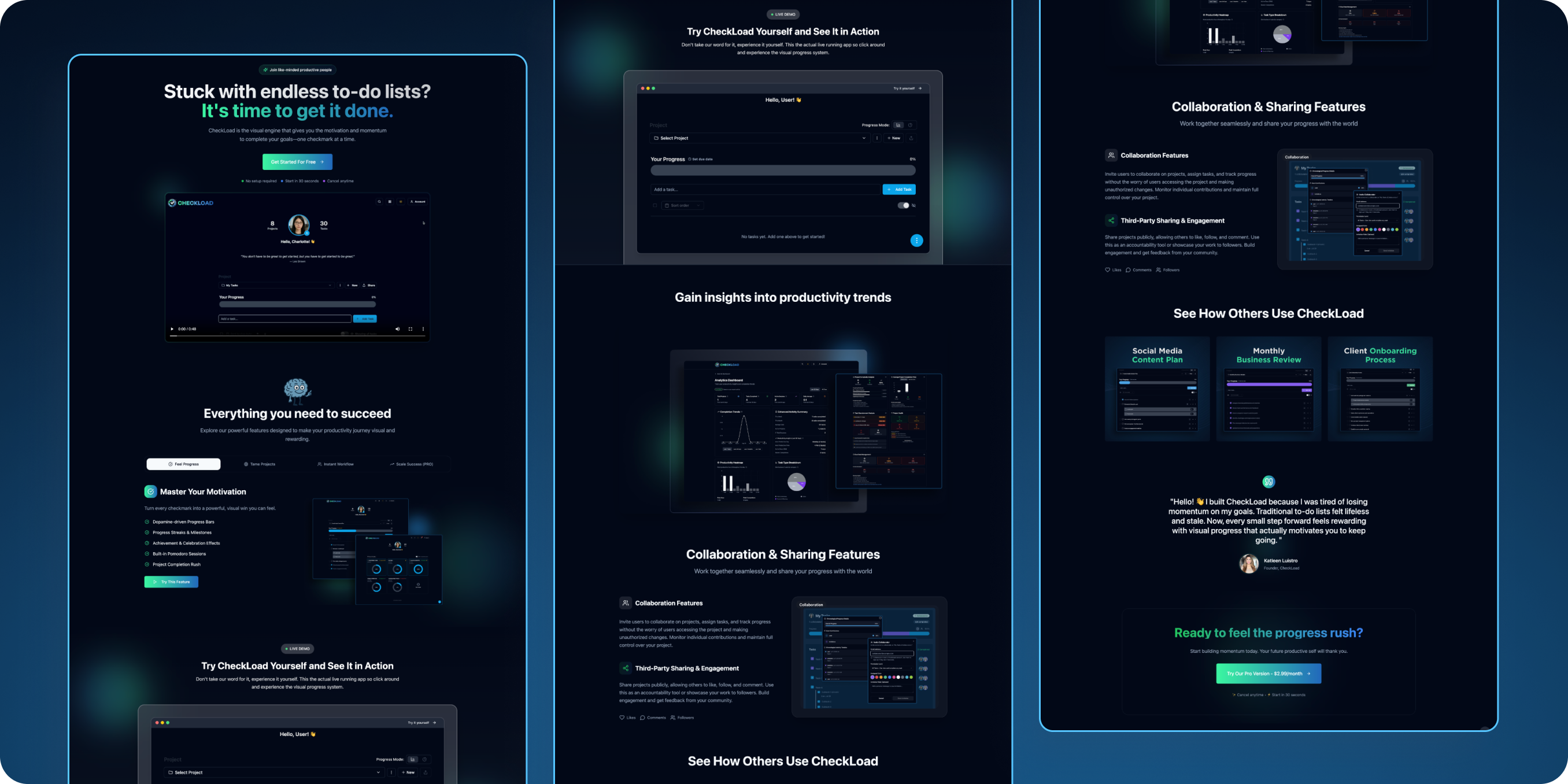
The CheckLoad website was designed to mirror the app’s core philosophy: simple, clean, and to the point. The focus is on clarity, trust, and hands-on exploration, ensuring users immediately understand the value and can experience it without friction.
1. Clarity Over Clutter
The site embraces a minimalist aesthetic to showcase the product without distractions. Each section is focused on answering a single user question: “How will this help me?” Concise text explains the benefits, while paired visuals—screenshots, mockups, and animations—bring those explanations to life.
2. Immediate Understanding Through Video
A product video at the top provides instant context. Users see how CheckLoad works, what problems it solves, and why it’s different—all in under a minute. This helps potential users quickly decide if it’s worth exploring further.
3. Hands-On Live Demo
Recognizing that users don’t want to provide personal information before knowing if an app is right for them, I built in a live demo. This allows visitors to explore CheckLoad directly, no signup required. It reflects my own experience as a user: trust is earned when you can test-drive a product before committing.
4. Feature Spotlights
Key features—progress tracking, weighted modes, collaboration controls, reminders, calendar view, Pomodoro timer, and more—are presented in straightforward sections. Each feature is explained with text and supported with visuals so users see both the “why” and the “how.”
5. Showcase & Inspiration
To help users envision CheckLoad in their own workflow, the site includes a showcase section featuring examples of how others use the app—whether for work projects, personal goals, or team accountability. This section inspires new users while validating that the product is versatile and trusted.
6. Strategic CTAs
Calls-to-action (CTAs) are placed strategically and tastefully, guiding users without overwhelming them. CTAs appear at natural decision points, ensuring users always have a clear next step—whether that’s trying the demo, creating an account, or reaching out—without feeling bombarded.
7. Founder’s Message
A personal message from me is included to humanize the brand. It introduces who I am, why I built CheckLoad, and provides a direct line of contact. This transparency builds trust and helps users feel connected to the product’s vision.
TAKEAWAYS
Building CheckLoad taught me that the best products start by solving a real personal pain point and validating it with a broader audience. By making the progress bar the centerpiece, I was able to turn a common frustration into a source of motivation, supported by research on how visual progress drives consistency. The design’s simplicity and paper-like feel helped the app stand out from traditional SaaS dashboards, making it more personal and approachable. Leveraging AI tools accelerated the build and allowed me to launch an MVP in just weeks, while ongoing user feedback and iteration ensured the product became something people genuinely enjoy using. Finally, elements like a live demo, showcase examples, and a personal founder’s message reinforced transparency and trust, proving that usability and human connection are just as important as features.
View website 💻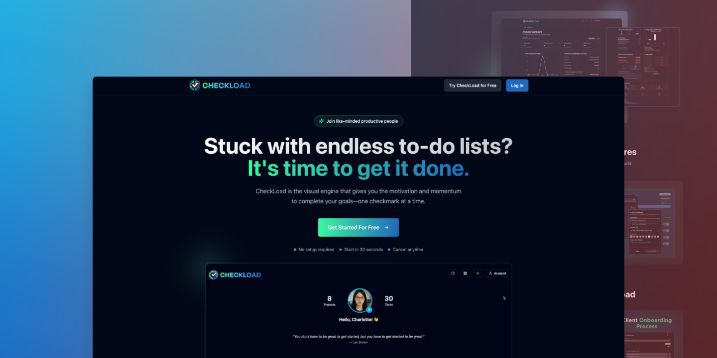


.svg)