BRAND GUIDELINE
As with all new projects, I began with a kick-off meeting with the client to fully understand their company, values, and visual goals. This discovery was followed by in-depth research of the home improvement market in Colorado to identify opportunities for differentiation. The insights gathered shaped Mile High Home Works’ brand identity strategy, which focused on creating a sleek, modern, and highly recognizable visual presence that communicates both trust and craftsmanship.Based on this foundation, I developed a comprehensive brand identity system with the following key components:
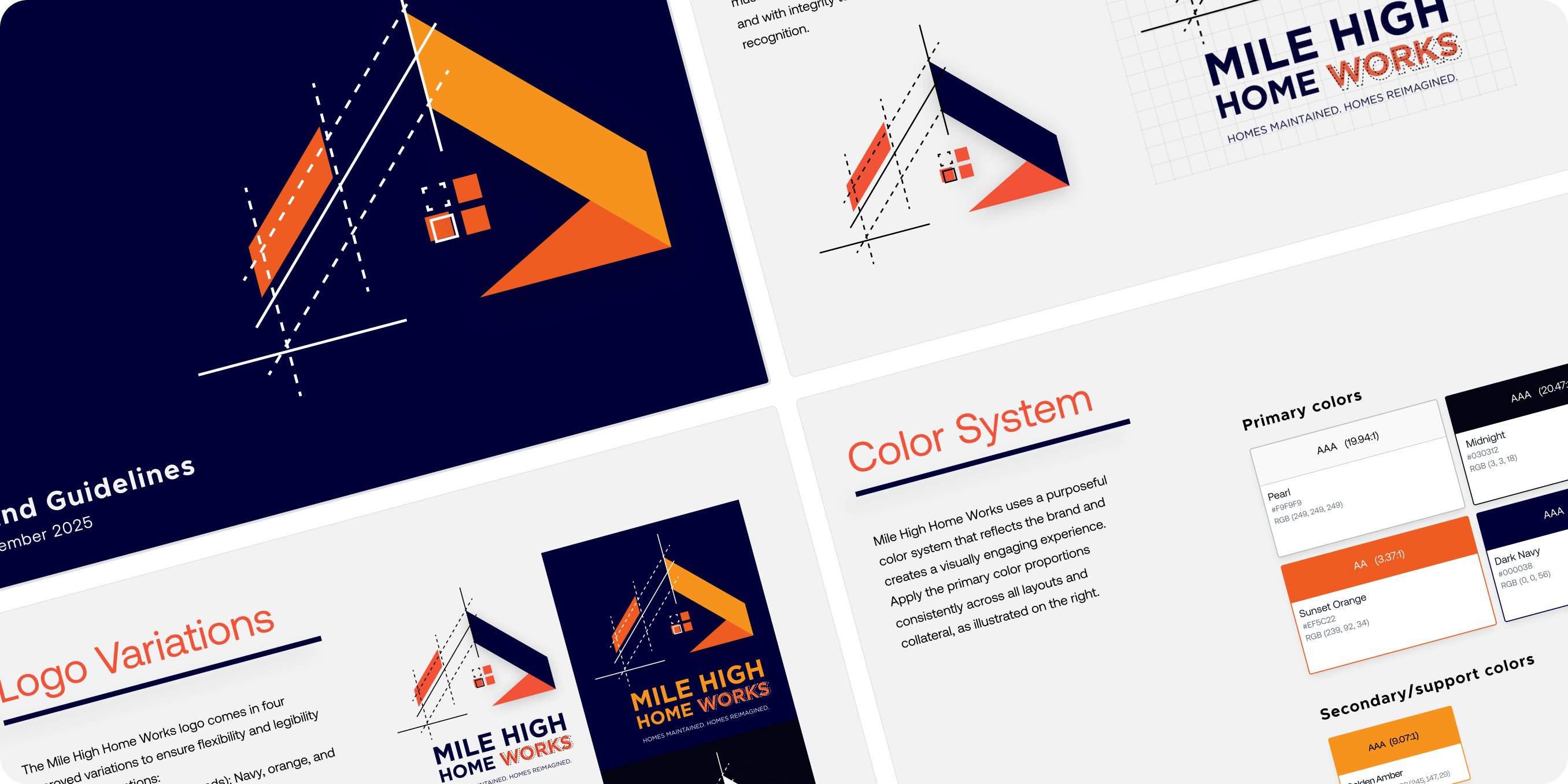
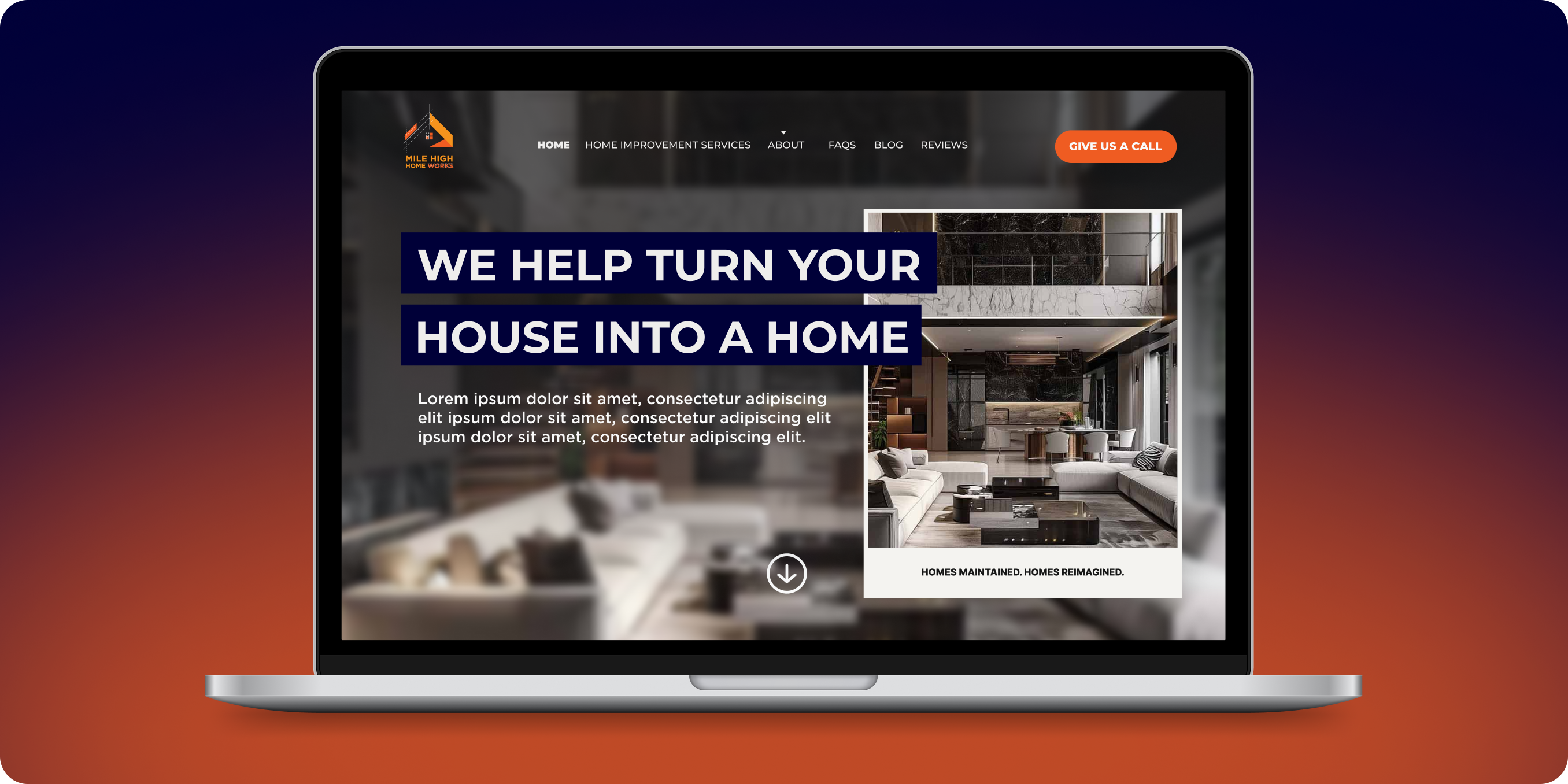
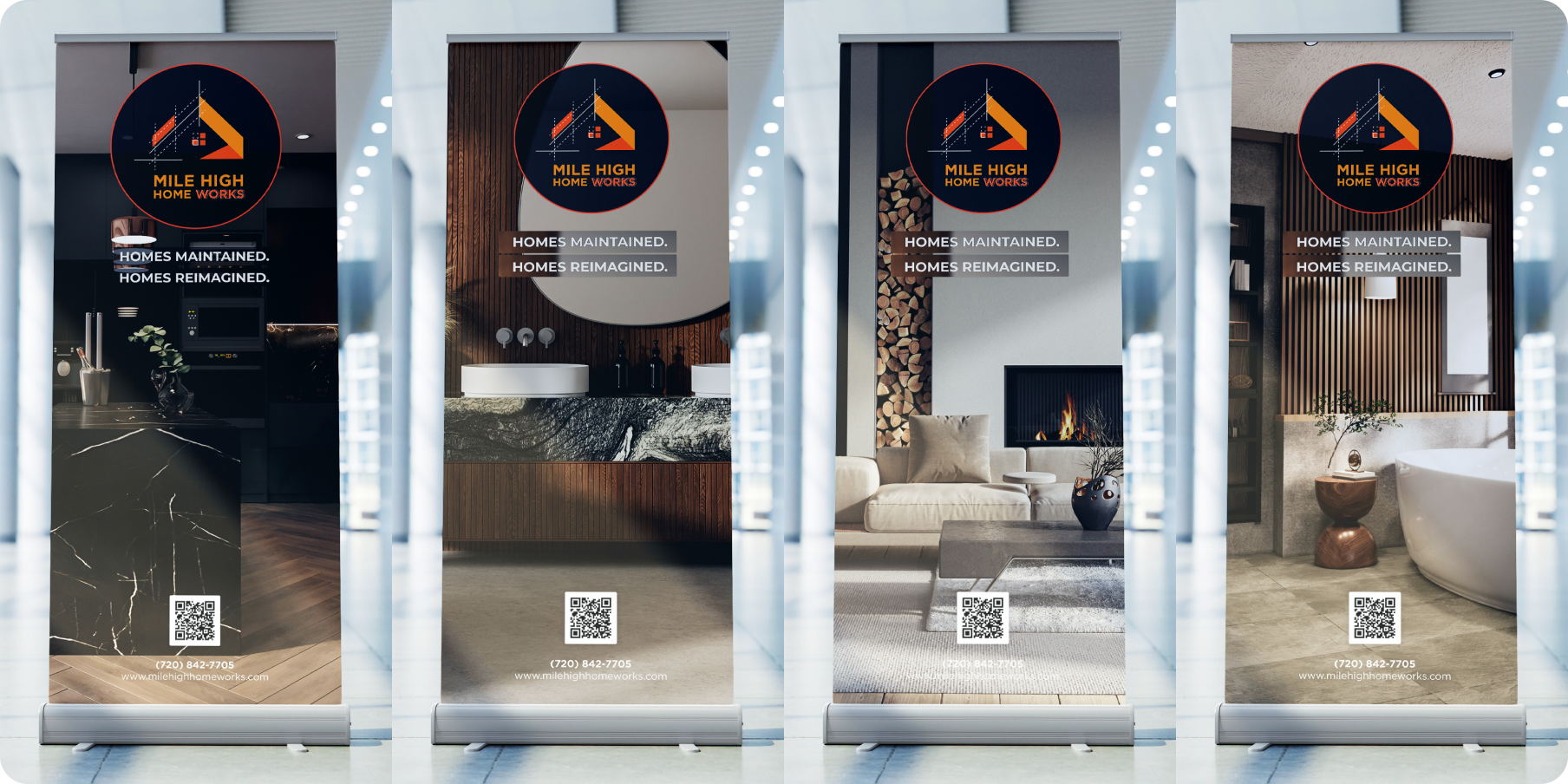
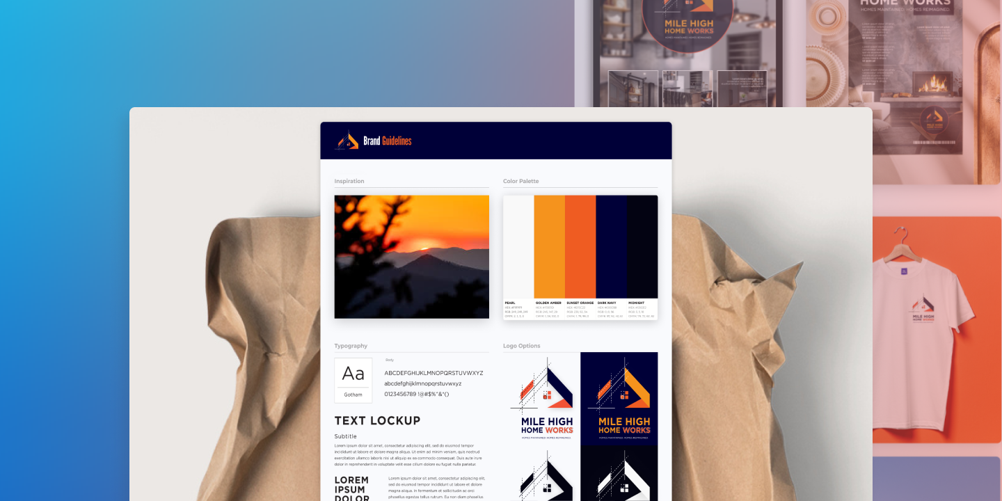
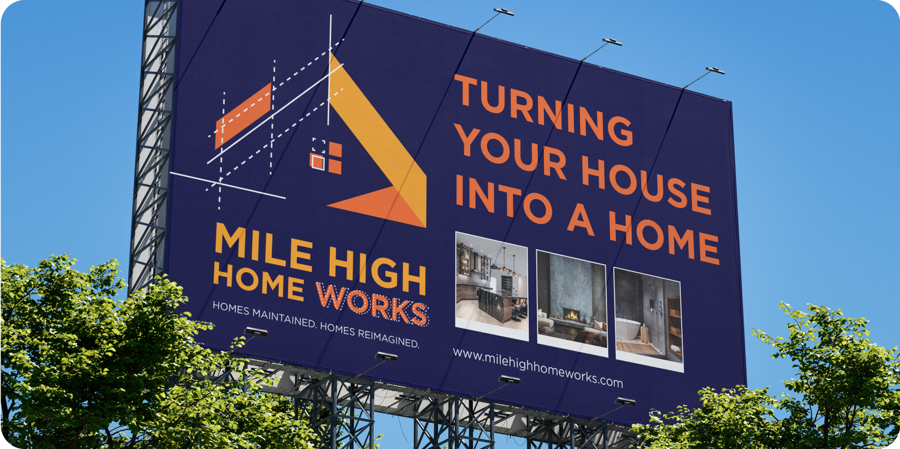
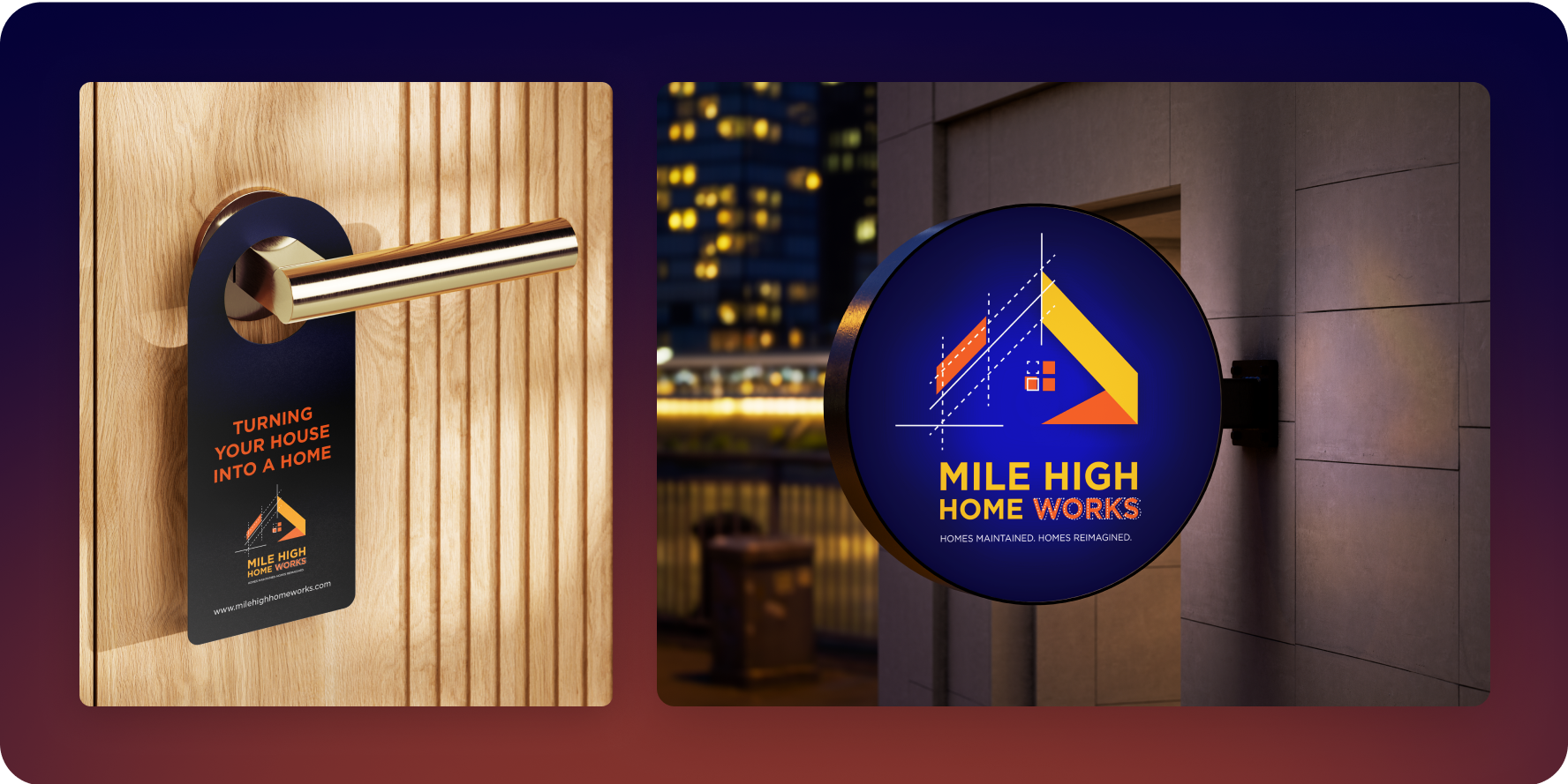
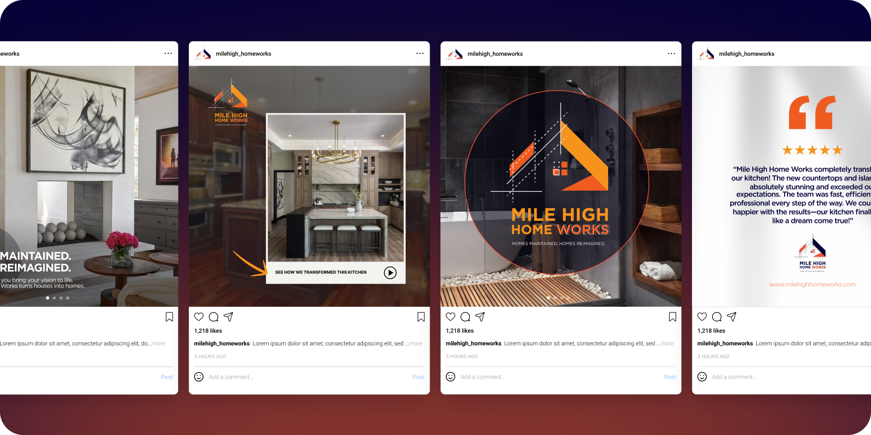
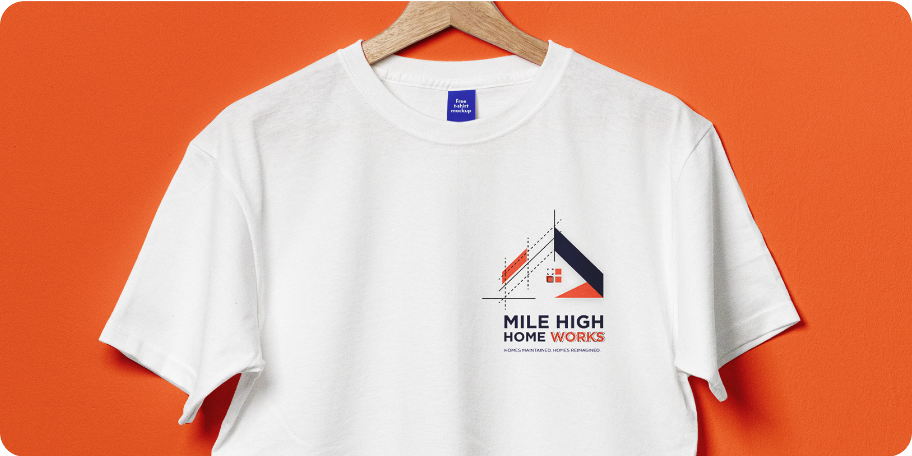
• Logo design: The final logo incorporates the silhouette of a house rendered in a blueprint-inspired style. This not only conveys structure, planning, and craftsmanship but also visually hints at the company’s role in both maintaining and reimagining homes. The blueprint lines serve as a metaphor for “before and after,” highlighting transformation through construction and design improvements.
• Color Palette: To honor the company’s Colorado roots, the palette draws inspiration from the state’s sunsets and the iconic Denver Broncos. The balance of deep navy, vibrant orange, and warm coral reflects both authority and creativity, while remaining approachable and modern. This combination ensures the brand stands out in a crowded, often traditional industry.
• Typography: Clean, geometric sans-serif typography was paired with structured type treatments to reinforce professionalism and modernity. The type is versatile and highly legible across digital and print applications, from signage to web.Imagery: The imagery strategy emphasizes transformation—showcasing interiors and exteriors that reflect the company’s renovation and restoration expertise. Photos are presented with bright, editorial-style lighting to evoke quality, trust, and aspiration.

TAKEAWAYS
Developing the brand identity for Mile High Home Works reinforced the value of grounding design in both client vision and regional context. By blending blueprint-inspired elements with colors tied to Colorado’s identity, I created a system that feels modern, trustworthy, and distinctive in a crowded market. The process highlighted the importance of balancing creativity with practicality—ensuring every visual decision translated seamlessly across print, digital, and environmental applications.
.svg)